
Step 4: Add Expansion Panels and Tabs 1.0
In this final step, you’ll use expansion panels and tabs to hide information until the user needs it. You’ll use these components:
-
<material-expansionpanel>and<material-expansionpanel-set> -
<material-tab>and<material-tab-panel>
Run the live example (view source) of the `` version of the app.
Use material-expansionpanel and material-expansionpanel-set
Expansion panels are especially good for settings, so use them in the
custom <settings-component>, implemented in
lib/src/settings/settings_component.* files.
-
Edit the Dart file (
lib/src/settings/settings_component.dart), adding the expansion panel directives MaterialExpansionPanel and MaterialExpansionPanelSet: -
Edit the template file (
lib/src/settings/settings_component.html) to change the enclosing<div>element (the first and last lines of the file) to be a<material-expansionpanel-set>. -
Convert the Wallet div into a
<material-expansionpanel>(MaterialExpansionPanel):- Change the
<div>element to<material-expansionpanel>. - Move the title (
h2content) and summary content (pcontent) into the<material-expansionpanel>nameandsecondaryTextattributes, respectively. - Remove the buttons from the bottom of the panel,
putting their event handling code into
(save)and(cancel)bindings. Your code changes to the beginning of this file should look like this:
- Change the
-
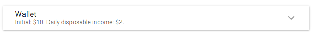
Test the app. The Wallet settings should look like this at first:
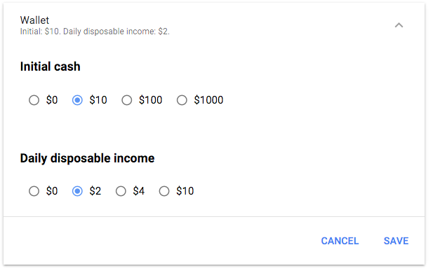
When you expand the Wallet settings, they should look like this:
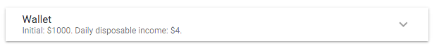
When you change settings and click the SAVE button at bottom right, the new values should appear in the UI:
-
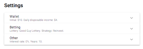
Once the app runs correctly, convert the two remaining major divs (Betting and Other) into material expansion panels.
That bit of work saved a lot of UI space:
Use material-tab and material-tab-panel
You can save more by moving auxiliary text into separate tabs.
This affects the main UI, implemented in lib/lottery_simulator.* files.
-
Make the following changes to
lib/lottery_simulator.dart: -
Edit
lib/lottery_simulator.html:-
After the end of the first
<div>, add a<material-tab-panel>tag. -
Put the closing tag of the
<material-tab-panel>at the end of the file. -
Just after the opening
<material-tab-panel>tag, add a<material-tab>tag with the label set to “Simulation”. -
Close the
<material-tab-panel>near the bottom of the file, just before the<div>containing the Help heading.Your changes, so far, should look like this:
<h1>Lottery Simulator</h1>

<div class="help">
  ...
</div>

<material-tab-panel>
  <material-tab label="Simulation">
    ...
  </material-tab>
<div>
  <h2>Help`</h2>`
  ...
</div>
</material-tab-panel>
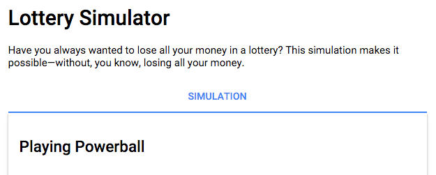
If you run the app now, the top of the UI should look like this:
-
Change the next two
<div>-<h2>combinations into<material-tabs>, with the labels “Help” and “About”.
-
The end of the file should look like this:
Your app should now look exactly like the one you saw in the first page of this codelab.
Congratulations! You’ve converted a functional but UI-challenged app into a good looking, well-behaved app that uses the next generation of AngularDart Components.
Problems?
Check your code against the solution in the 4-final directory.