
Forms 6.0
Forms are the mainstay of business apps. You use forms to log in, submit a help request, place an order, book a flight, schedule a meeting, and perform countless other data-entry tasks.
In developing a form, it’s important to create a data-entry experience that guides the user efficiently and effectively through the workflow.
Developing forms requires design skills (which are out of scope for this page), as well as framework support for two-way data binding, change tracking, validation, and error handling, which you’ll learn about on this page.
This page shows you how to build a simple form from scratch. Along the way you’ll learn how to:
- Build an Angular form with a component and template.
- Use
ngModelto create two-way data bindings for reading and writing input-control values. - Track state changes and the validity of form controls.
- Provide visual feedback using special CSS classes that track the state of the controls.
- Display validation errors to users and enable/disable form controls.
- Share information across HTML elements using template reference variables.
You can run the live example (view source) in Plunker and download the code from there.
Template-driven forms
You can build forms by writing templates in the Angular template syntax with the form-specific directives and techniques described in this page.
You can build almost any form with an Angular template—login forms, contact forms, and pretty much any business form. You can lay out the controls creatively, bind them to data, specify validation rules and display validation errors, conditionally enable or disable specific controls, trigger built-in visual feedback, and much more.
Angular makes the process easy by handling many of the repetitive, boilerplate tasks you’d otherwise wrestle with yourself.
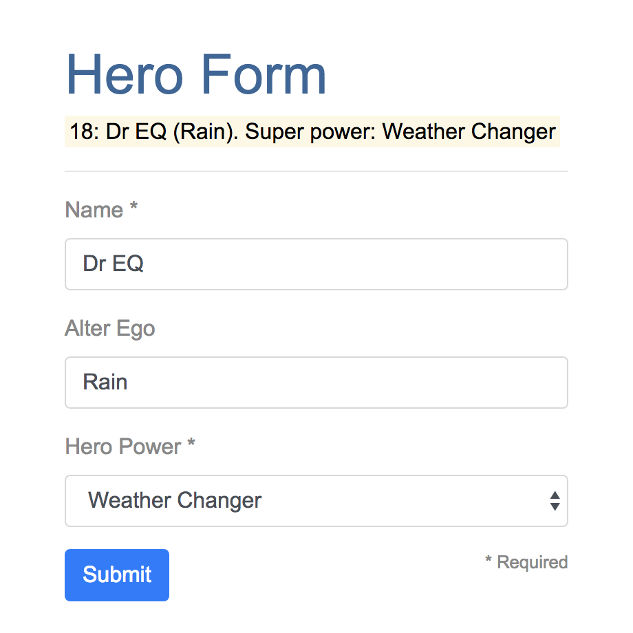
You’ll learn to build a template-driven form that looks like this:
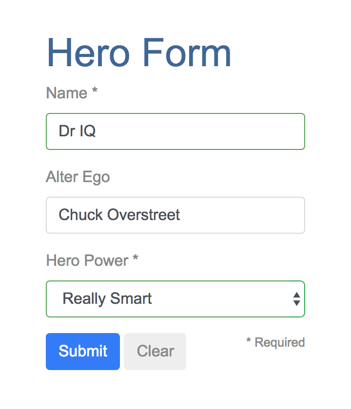
The Hero Employment Agency uses this form to maintain personal information about heroes. Every hero needs a job. It’s the company mission to match the right hero with the right crisis.
Two of the three fields on this form are required. Following material design guidelines, required fields have an asterisk (*).
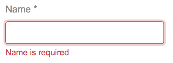
If you delete the hero name, the form displays a validation error in an attention-grabbing style:
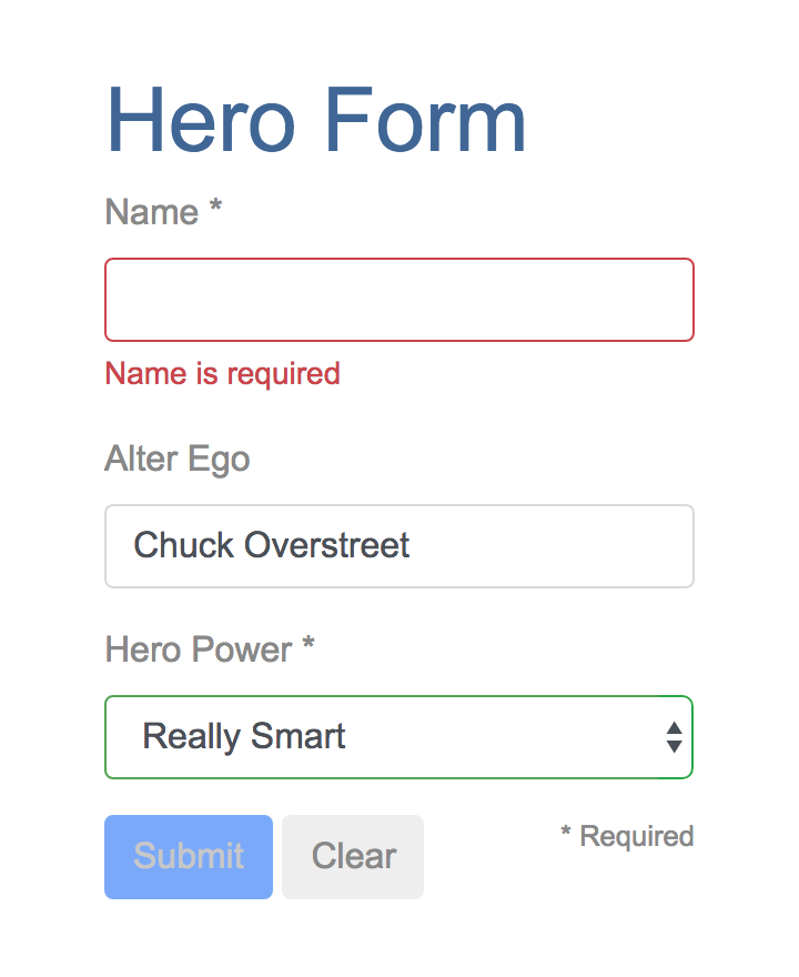
Note that the Submit button is disabled, and the input control changes from green to red.
You’ll build this form in small steps:
- Create the
Heromodel class. - Create the component that controls the form.
- Create a template with the initial form layout.
- Bind data properties to each form control using the ngModel two-way data-binding syntax.
- Add an ngControl directive to each form-input control.
- Add custom CSS to provide visual feedback.
- Show and hide validation-error messages.
- Handle form submission with ngSubmit.
- Disable the form’s Submit button until the form is valid.
Setup
Follow the setup instructions to create a new project named forms.
Add angular_forms
The Angular forms functionality is in the angular_forms library, which comes in its own package. Add the package to the pubspec dependencies:
Create a model
As users enter form data, you’ll capture their changes and update an instance of a model. You can’t lay out the form until you know what the model looks like.
A model can be as simple as a “property bag” that holds facts about a thing of importance for the app.
That describes well the Hero class with its three required fields (id, name, power)
and one optional field (alterEgo).
In the lib directory, create the following file with the given content:
lib/src/hero.dart
class Hero {
  int id;
  String name, power, alterEgo;

  Hero(this.id, this.name, this.power, [this.alterEgo]);

  String toString() => '$id: $name ($alterEgo). Super power: $power';
}
It’s an anemic model with few requirements and no behavior, good enough for the demo.
The alterEgo is optional, so the constructor lets you omit it;
note the brackets in [this.alterEgo].
You can create a new hero like this:
var myHero =
    Hero(42, 'SkyDog', 'Fetch any object at any distance', 'Leslie Rollover');
print('My hero is ${myHero.name}.'); // "My hero is SkyDog."
Create a basic form
An Angular form has two parts: an HTML-based template and a component class to handle data and user interactions programmatically. Begin with the class because it states, in brief, what the hero editor can do.
Create a form component
Create the following file with the given content:
lib/src/hero_form_component.dart (v1)
import 'package:angular/angular.dart';
import 'package:angular_forms/angular_forms.dart';

import 'hero.dart';

const List<String> _powers = [
  'Really Smart',
  'Super Flexible',
  'Super Hot',
  'Weather Changer'
];

@Component(
  selector: 'hero-form',
  templateUrl: 'hero_form_component.html',
  directives: [coreDirectives, formDirectives],
)
class HeroFormComponent {
  Hero model = Hero(18, 'Dr IQ', _powers[0], 'Chuck Overstreet');
  bool submitted = false;

  List<String> get powers => _powers;

  void onSubmit() => submitted = true;
}
There’s nothing special about this component, nothing form-specific, nothing to distinguish it from any component you’ve written before.
Understanding this component requires only the Angular concepts covered in previous pages.
- The code imports the main Angular library and the
Heromodel you just created. - The
@Componentselector value ofhero-formmeans you can drop this form in a parent template with a<hero-form>element. - The
templateUrlproperty points to a separate file (which you’ll create shortly) for the template HTML. -
You defined mock data for
modelandpowers.Down the road, you can inject a data service to get and save real data or perhaps expose these properties as inputs and outputs (see Input and output properties in the Template Syntax page) for binding to a parent component. This is not a concern now and these future changes won’t affect the form.
Revise the app component
AppComponent is the app’s root component. It will host the HeroFormComponent.
Replace the contents of the starter app version with the following:
lib/app_component.dart
import 'package:angular/angular.dart';

import 'src/hero_form_component.dart';

@Component(
  selector: 'my-app',
  template: '<hero-form></hero-form>',
  directives: [HeroFormComponent],
)
class AppComponent {}
Create an initial form template
Create the template file with the following contents:
lib/src/hero_form_component.html (start)
<div class="container">
<h1>Hero Form</h1>
<form>
<div class="form-group">
<label for="name">Name *</label>
<input type="text" class="form-control" id="name" required>
</div>
<div class="form-group">
<label for="alterEgo">Alter Ego</label>
<input type="text" class="form-control" id="alterEgo">
</div>
<div class="row">
<div class="col-auto">
<button type="submit" class="btn btn-primary">Submit</button>
</div>
<small class="col text-right">* Required</small>
</div>
</form>
</div>The language is simply HTML5. You’re presenting two of the Hero fields, name and alterEgo, and
opening them up for user input in input boxes.
The Name <input> control has the HTML5 required attribute;
the Alter Ego <input> control does not because alterEgo is optional.
You added a Submit button at the bottom with some classes on it for styling.
You’re not using Angular yet. There are no bindings or extra directives, just layout.
In template driven forms, if you’ve imported the angular_forms library, you don’t have to do anything
to the <form> tag in order to make use of the library capabilities. Continue on to see how this works.
open_in_browser Refresh the browser. You’ll see a simple, unstyled form.
Style the form
The general CSS classes container and btn come from Bootstrap.
Bootstrap also has form-specific classes including form-control and form-group.
Together, these give the form a little style.
Angular makes no use of Bootstrap classes or the styles of any external library. Angular apps can use any CSS library or none at all.
Add Bootstrap styles by inserting the following link to the <head> of index.html:
web/index.html (bootstrap)
<link rel="stylesheet"
      href="https://maxcdn.bootstrapcdn.com/bootstrap/4.0.0-beta/css/bootstrap.min.css"
      integrity="sha384-/Y6pD6FV/Vv2HJnA6t+vslU6fwYXjCFtcEpHbNJ0lyAFsXTsjBbfaDjzALeQsN6M"
      crossorigin="anonymous">
open_in_browser Refresh the browser. You’ll see a form with style!
Add powers with *ngFor
The hero must choose one superpower from a fixed list of agency-approved powers.
You maintain that list internally (in HeroFormComponent).
You’ll add a select to the
form and bind the options to the powers list using ngFor,
a technique seen previously in the Displaying Data page.
Add the following HTML immediately below the Alter Ego group:
lib/src/hero_form_component.html (powers)
<div class="form-group">
<label for="power">Hero Power *</label>
<select class="form-control" id="power" required>
<option *ngFor="let p of powers" [value]="p">{{p}}</option>
</select>
</div>This code repeats the <option> tag for each power in the list of powers.
The p template input variable is a different power in each iteration;
you display its name using the interpolation syntax.
Two-way data binding with ngModel
open_in_browser Running the app now is a bit disappointing.
You don’t see hero data because you’re not binding to the Hero yet.
You know how to do that from earlier pages.
Displaying Data teaches property binding.
User Input shows how to listen for DOM events with an
event binding and how to update a component property with the displayed value.
Now you need to display, listen, and extract at the same time.
You could use the techniques you already know, but
instead you’ll use the new [(ngModel)] syntax, which
makes binding the form to the model easy.
Find the <input> tag for Name and update it like this:
lib/src/hero_form_component.html (name)
<!-- TODO: remove the next diagnostic line -->
<mark>{{model.name}}</mark><hr>
<div class="form-group">
<label for="name">Name *</label>
<input type="text" class="form-control" id="name" required
[(ngModel)]="model.name"
ngControl="name">
</div>You added a diagnostic interpolation before the form-group so you can see what you’re doing. You left yourself a note to throw it away when you’re done.
Focus on the binding syntax: [(ngModel)]="...".
open_in_browser Run the app now and type in the Name input, adding and deleting characters. You’ll see the characters appear and disappear from the diagnostic text. At some point it might look like this:
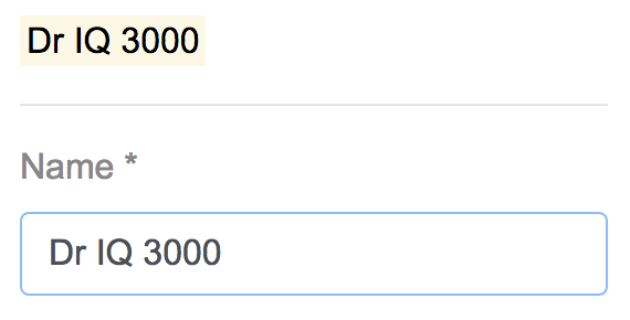
The diagnostic is evidence that values really are flowing from the input to the model and back again.
That’s two-way data binding. For more information, see Two-way binding with NgModel on the the Template Syntax page.
Notice that you also added an ngControl directive to the <input> tag and set it to “name”,
which makes sense for the hero’s name. Any unique value will do, but using a descriptive name is helpful.
Defining an ngControl directive is a requirement when using [(ngModel)] in combination with a form.
Internally, Angular creates NgFormControl instances and
registers them with an NgForm directive that Angular attached to the <form> tag.
Each NgFormControl is registered under the name you assigned to the ngControl directive.
You’ll read more about NgForm later in this guide.
Add similar [(ngModel)] bindings and ngControl directives to Alter Ego and Hero Power.
Replace the diagnostic binding expression with model. This way you can
confirm that two-way data binding works for the entire hero model.
After revision, the core of the form should look like this:
lib/src/hero_form_component.html (controls)
<!-- TODO: remove the next diagnostic line -->
<mark>{{model}}</mark><hr>
<div class="form-group">
<label for="name">Name *</label>
<input type="text" class="form-control" id="name" required
[(ngModel)]="model.name"
ngControl="name">
</div>
<div class="form-group">
<label for="alterEgo">Alter Ego</label>
<input type="text" class="form-control" id="alterEgo"
[(ngModel)]="model.alterEgo"
ngControl="alterEgo">
</div>
<div class="form-group">
<label for="power">Hero Power *</label>
<select class="form-control" id="power" required
[(ngModel)]="model.power"
ngControl="power">
<option *ngFor="let p of powers" [value]="p">{{p}}</option>
</select>
</div>- Each input element has an
idproperty that is used by thelabelelement’sforattribute to match the label to its input control. - Each input element has a
ngControldirective that is required by Angular forms to register the control with the form.
If you run the app now and change every hero model property, the form might display like this:
The diagnostic near the top of the form confirms that all of your changes are reflected in the model.
Delete the diagnostic binding from the template since it has served its purpose.
Give visual feedback based on control state
Using CSS and class bindings, you can change a form control’s appearance to reflect its state.
Track control state
An Angular form control can tell you if the user touched the control, if the value changed, or if the value became invalid.
Each control (NgControl) in an Angular form tracks its own state and makes the state available for inspection through the following field members:
-
dirtyandpristineindicate whether the control’s value has changed. -
touchedanduntouchedindicate whether the control has been visited. -
validreflects the control value’s validity.
Style controls
The valid control property is the most interesting, because you want to send a
strong visual signal when a control value is invalid.
To create such visual feedback, you’ll use the
Bootstrap custom-forms classes is-valid and is-invalid.
Add a template reference variable called name
to the Name <input> tag. Use name and class bindings
to conditionally assign the appropriate form validity class.
Temporarily add another template reference variable named spy
to the Name <input> tag and use it to display the input’s CSS classes.
lib/src/hero_form_component.html (name)
<input type="text" class="form-control" id="name" required
       [(ngModel)]="model.name"
       #name="ngForm"
       #spy
       [class.is-valid]="name.valid"
       [class.is-invalid]="!name.valid"
       ngControl="name">
<!-- TODO: remove the next diagnostic line -->
{{spy.className}}
Template reference variables
The spy template reference variable gets bound to the
<input> DOM element, whereas the name variable (through the #name="ngForm" syntax)
gets bound to the NgModel
associated with the input element.
Why “ngForm”? A Directive’s
exportAs property tells Angular
how to link the reference variable to the directive. You set name to “ngForm”
because the ngModel
directive’s exportAs property is “ngForm”.
open_in_browser Refresh the browser, and follow these steps:
- Look at the Name input.
- It has a green border.
- Its has the classes
form-controlandis-valid.
- Change the name by adding some characters. The classes remain the same.
- Delete the name.
- The input box border turns red.
- The
is-invalidclass replacesis-valid.
Delete the #spy template reference variable and the diagnostic that uses it.
As an alternative to class bindings, you can use an NgClass directive to style a control. First, add the following method to set a control’s state-dependent CSS class names:
lib/src/hero_form_component.dart (setCssValidityClass)
Map<String, bool> setCssValidityClass(NgControl control) {
  final validityClass = control.valid == true ? 'is-valid' : 'is-invalid';
  return {validityClass: true};
}
Use the map value returned by this method to bind to the NgClass directive — read more about this directive and its alternatives in the template syntax page.
lib/src/hero_form_component.html (power)
<select class="form-control" id="power" required
        [(ngModel)]="model.power"
        #power="ngForm"
        [ngClass]="setCssValidityClass(power)"
        ngControl="power">
  <option *ngFor="let p of powers" [value]="p">{{p}}</option>
</select>
Show and hide validation error messages
You can improve the form. The Name input is required, and clearing it turns the box outline red. That says something is wrong but the user doesn’t know what is wrong or what to do about it. Leverage the control’s state to reveal a helpful message.
Use the valid and pristine states
When the user deletes the name, the form should look like this:
To achieve this effect, add the following <div> immediately after the Name <input>:
lib/src/hero_form_component.html (hidden error message)
<div [hidden]="name.valid || name.pristine" class="invalid-feedback">
  Name is required
</div>
open_in_browser Refresh the browser and delete the Name input. The error message is displayed.
You control visibility of the error message by setting the hidden attribute
of the <div> based on the state of the name control.
In this example, you hide the message when the control is valid or pristine — “pristine” means the user hasn’t changed the value since it was displayed in this form.
User experience is the developer’s choice
Some developers want the message
to display at all times. If you ignore the pristine state, you would hide the
message only when the value is valid. If you arrive in this component with a
new (blank) hero or an invalid hero, you’ll see the error message immediately,
before you’ve done anything.
Some developers want the message to display only when the user makes an invalid change. Hiding the message while the control is “pristine” achieves that goal. You’ll see the significance of this choice when you add a Clear button to the form.
The hero Alter Ego is optional so you can leave that be.
Hero Power selection is required. You can add the same kind of error message
to the <select> if you want, but it’s not imperative because the selection box
already constrains the power to valid values.
Add a Clear button
Add a clear() method to the component class:
lib/src/hero_form_component.dart (clear)
void clear() {
  model.name = '';
  model.power = _powers[0];
  model.alterEgo = '';
}
Add a Clear button with a click event binding, right after the Submit button:
lib/src/hero_form_component.html (Clear button)
<button (click)="clear()" type="button" class="btn">
  Clear
</button>
open_in_browser Refresh the browser. Click the Clear button. The text fields go blank, and if you’ve changed the power, it reverts to its default value.
Submit the form with ngSubmit
The user should be able to submit this form after filling it in.
The Submit button at the bottom of the form
does nothing on its own, but it will
trigger a form submit because of its type (type="submit").
A form submit is useless at the moment. To make it useful, assign
form component’s onSubmit() method to the form’s ngSubmit event binding:
<form (ngSubmit)="onSubmit()" #heroForm="ngForm">Note the template reference variable #heroForm.
As was explained earlier,
the variable heroForm gets bound to the NgForm directive that governs the form as a whole.
The NgForm directive
Angular automatically creates and attaches an NgForm directive to the <form> tag.
The NgForm directive supplements the form element with additional features.
It holds the controls you created for the elements with ngModel and ngControl directives,
and monitors their properties, including their validity.
You’ll bind the form’s overall validity via
the heroForm variable to the button’s disabled property:
<button [disabled]="!heroForm.form.valid" type="submit" class="btn btn-primary">
  Submit
</button>
open_in_browser Refresh the browser. You’ll find that the button is enabled—although it doesn’t do anything useful yet.
Now if you delete the Name, you violate the “required” rule, which is duly noted in the error message. The Submit button is also disabled.
Not impressed? Think about it for a moment. What would you have to do to wire the button’s enable/disabled state to the form’s validity without Angular’s help?
For you, it was as simple as this:
- Define a template reference variable on the (enhanced) form element.
- Refer to that variable in a button many lines away.
Display the model (optional)
Submitting the form has no visual effect at the moment.
As can be expected for a demo. Jazzing up the demo won’t teach you anything new about forms. But this is an opportunity to exercise some of your newly won binding skills. If you aren’t interested, skip to this page’s summary.
As a visual effect, you can hide the data entry area and display something else.
Wrap the form in a <div> and bind
its hidden property to the HeroFormComponent.submitted property.
lib/src/hero_form_component.html (excerpt)
<div [hidden]="submitted">
  <h1>Hero Form</h1>
  <form (ngSubmit)="onSubmit()" #heroForm="ngForm">
    <!-- ··· -->
  </form>
</div>
The form is visible from the start because the
submitted property is false until you submit the form,
as this fragment from the HeroFormComponent shows:
lib/src/hero_form_component.dart (submitted)
bool submitted = false;

void onSubmit() => submitted = true;
Now add the following HTML below the <div> wrapper you just wrote:
lib/src/hero_form_component.html (submitted)
<div [hidden]="!submitted">
  <h1>Hero data</h1>

  <table class="table">
    <tr>
      <th>Name</th>
      <td>{{model.name}}</td>
    </tr>
    <tr>
      <th>Alter Ego</th>
      <td>{{model.alterEgo}}</td>
    </tr>
    <tr>
      <th>Power</th>
      <td>{{model.power}}</td>
    </tr>
  </table>

  <button (click)="submitted=false" class="btn btn-primary">Edit</button>
</div>
open_in_browser
Refresh the browser, and submit the form.
The submitted flag becomes true and the form disappears.
You’ll see the hero model values (read-only) displayed in a table.
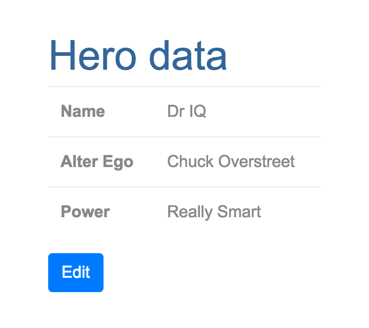
The view includes an Edit button whose click event binding clears the submitted flag.
When you click the Edit button, the table disappears and the editable form reappears.
Summary
Angular forms provide support for data modification, validation, and more. In this page, you learned how to use the following features:
- An HTML form template, and a form component class with an
@Componentannotation. - Form submission, handled through an
ngSubmitevent binding. - Template reference variables, such as
heroFormandname. - Two-way data bindings (
[(ngModel)]). -
NgControldirectives for validation and form-element change tracking. - The
validproperty of input controls (accessed through template reference variables), for checking control validity and showing/hiding error messages. - NgForm.form validity to set the Submit button’s enabled state.
- Custom CSS classes to provide visual feedback to users about control state.
The final project folder structure should look like this:
- angular_forms
- lib
- app_component.dart
- src
- hero.dart
- hero_form_component.{dart,html}
- web
- index.html
- main.dart
- styles.css
- pubspec.yaml
- lib
Here’s the code for the final version of the app: