
Master/Detail 6.0
In this page, you’ll expand the Tour of Heroes app to display a list of heroes, and allow users to select a hero and display the hero’s details.
When you’re done with this page, the app should look like this live example (view source).
Where you left off
Before you continue with this page of the Tour of Heroes, verify that you have the following structure after The Hero Editor page. If your structure doesn’t match, go back to that page to figure out what you missed.
- angular_tour_of_heroes
- lib
- app_component.dart
- hero.dart
- test
- app_test.dart
- web
- index.html
- main.dart
- styles.css
- analysis_options.yaml
- pubspec.yaml
- lib
If the app isn’t running already, launch the app. As you make changes, keep it running by reloading the browser window.
App refactoring
Before adding new features, you’ll benefit from refactoring the app a little.
App template file
You’ll be making several updates to the app component’s template. First, move the template to its own file:
lib/app_component.html
<h1>{{title}}</h1>
<h2>{{hero.name}}</h2>
<div><label>id: </label>{{hero.id}}</div>
<div>
  <label>name: </label>
  <input [(ngModel)]="hero.name" placeholder="name">
</div>
Replace the @Component template parameter by a templateUrl referring
to the new template file:
lib/app_component.dart (templateUrl)
@Component(
  selector: 'my-app',
  templateUrl: 'app_component.html',
  // ···
)
open_in_browser Refresh the browser, and the app still runs.
Hero class
It is good practice to place implementation files under the lib/src
folder. Make the following changes to your project:
- Create the
lib/srcfolder. - Move
hero.dartintolib/src. - In the app component, adjust the import path to the hero file.
lib/app_component.dart (hero import)
import 'src/hero.dart';open_in_browser Refresh the browser. The app still runs, and you are now ready to add new features.
Displaying heroes
To display a list of heroes, you’ll add heroes to the view’s template.
Mock heroes
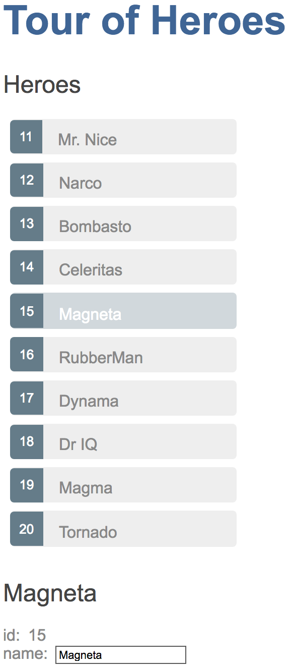
Create a list of ten heroes in the following file under lib/src:
lib/src/mock_heroes.dart
import 'hero.dart';

final mockHeroes = <Hero>[
  Hero(11, 'Mr. Nice'),
  Hero(12, 'Narco'),
  Hero(13, 'Bombasto'),
  Hero(14, 'Celeritas'),
  Hero(15, 'Magneta'),
  Hero(16, 'RubberMan'),
  Hero(17, 'Dynama'),
  Hero(18, 'Dr IQ'),
  Hero(19, 'Magma'),
  Hero(20, 'Tornado')
];
Eventually this app will fetch the list of heroes from a web service, but for now you can display mock heroes.
App heroes field
Replace the hero field with a heroes field in AppComponent,
and initialize it with mock heroes (don’t forget the import):
lib/app_component.dart (heroes)
import 'src/mock_heroes.dart';

// ···
class AppComponent {
  final title = 'Tour of Heroes';
  List<Hero> heroes = mockHeroes;
  // ···
}
The hero data is separated from the class implementation because ultimately the hero names will come from a data service.
Display hero names in a template
To display the hero names in an unordered list, replace all of the current template with the following HTML:
lib/app_component.html
<h1>{{title}}</h1>
<h2>Heroes</h2>
<ul class="heroes">
  <li>
    <!-- each hero goes here -->
  </li>
</ul>
Next you’ll add hero names.
List heroes with ngFor
The goal is to bind the list of heroes in the component to the template, iterate over them, and display them individually.
Modify the <li> tag by adding the core directive *ngFor.
<li *ngFor="let hero of heroes">The (*) prefix to ngFor is a critical part of this syntax.
It indicates that the <li> element and its children
constitute a master template.
The ngFor directive iterates over the component’s heroes list
and renders an instance of this template for each hero in that list.
The let hero part of the expression identifies hero as the template input variable,
which holds the current hero item for each iteration.
You can reference this variable within the template to access the current hero’s properties.
Read more about ngFor and template input variables in the
Showing a list property with *ngFor section of the
Displaying Data page and the
ngFor section of the
Template Syntax page.
Within the <li> element, add content
that uses the hero template variable to display the hero’s properties.
lib/app_component.html
<li *ngFor="let hero of heroes">
  <span class="badge">{{hero.id}}</span> {{hero.name}}
</li>
To use an Angular directive in a
template requires that it be listed in the directives argument of your
component’s @Component annotation. Similar to what you did in part 1,
add all coreDirectives:
lib/app_component.dart (directives)
@Component(
  selector: 'my-app',
  // ···
  directives: [coreDirectives, formDirectives],
)
open_in_browser Refresh the browser, and a list of heroes appears.
Style the heroes
Users should get a visual cue of which hero they are hovering over and which hero is selected.
To add styles to your component, you could set the styles argument of the @Component annotation:
// NOT recommended when adding many CSS classes:
styles: [
  '''
    .selected { ... }
    .heroes { ... }
    ...
  '''
],
But this makes the Dart file longer and less readable when adding many styles.
Instead, place the styles in a .css file, and refer to the file using the
styleUrls argument to @Component. By convention, the names of the
component’s CSS and Dart files have the same base (app_component).
When you assign styles to a component, they are scoped to that specific component.
These styles apply only to the AppComponent and don’t affect the outer HTML.
The template for displaying heroes should look like this:
lib/app_component.html
<h1>{{title}}</h1>
<h2>Heroes</h2>
<ul class="heroes">
  <li *ngFor="let hero of heroes">
    <span class="badge">{{hero.id}}</span> {{hero.name}}
  </li>
</ul>
Selecting a hero
The app now displays a list of heroes as well as a single hero in the details view. But the list and the details view are not connected. When users select a hero from the list, the selected hero should appear in the details view. This UI pattern is known as “master/detail.” In this case, the master is the heroes list and the detail is the selected hero.
Next you’ll connect the master to the detail through a selected component property,
which is bound to a click event.
Handle click events
Add a click event binding to the <li> like this:
lib/app_component.html (click)
<li *ngFor="let hero of heroes"
    (click)="onSelect(hero)">
  <span class="badge">{{hero.id}}</span> {{hero.name}}
</li>
The parentheses identify the <li> element’s click event as the target.
The onSelect(hero) expression calls the AppComponent method, onSelect(),
passing the template input variable hero, as an argument.
That’s the same hero variable you defined previously in the ngFor directive.
Learn more about event binding at the User Input page and the Event binding section of the Template Syntax page.
Add a click handler to expose the selected hero
You no longer need the hero property because you’re no longer displaying a single hero; you’re displaying a list of heroes.
But the user will be able to select one of the heroes by clicking on it.
So replace the hero property with this simple selected property:
lib/app_component.dart (selected)
Hero? selected;We use the ? to indicate that selected can be null since you won’t
initialize selected as you did with hero. The hero names should
all be unselected (in other words, selected should remain null) before the user picks
a hero. You can learn more about Dart’s null safety feature at Sound null safety
overview.
Add an onSelect() method that sets the selected property to the hero that the user clicks.
lib/app_component.dart (onSelect)
void onSelect(Hero hero) => selected = hero;The template still refers to the old hero property.
Bind to the new selected property instead as follows:
lib/app_component.html
<h2>{{selected!.name}}</h2>
<div><label>id: </label>{{selected!.id}}</div>
<div>
  <label>name: </label>
  <input [(ngModel)]="selected!.name" placeholder="name">
</div>
(Note the ! after selected. It is a null assertion
operator
that tells the Dart compiler that selected is not
null here and its properties can be accessed safely. Indeed, why would we want
to show a hero’s id and name when he/she is null?)
Hide the empty detail with ngIf
When the app loads, selected is null.
The selected hero is only initialized after the user clicks a hero’s name.
Angular can’t display properties of the null selected and throws the following error,
visible in the browser’s console:
EXCEPTION: Unexpected null value.
Although selected.name is displayed in the template,
you must keep the hero detail out of the DOM until there is a selected hero.
Wrap the HTML hero detail content of the template with a <div>.
Then add the ngIf core directive and set it to selected != null.
lib/app_component.html
<div *ngIf="selected != null">
  <h2>{{selected!.name}}</h2>
  <div><label>id: </label>{{selected!.id}}</div>
  <div>
    <label>name: </label>
    <input [(ngModel)]="selected!.name" placeholder="name">
  </div>
</div>
Don’t forget the asterisk (*) in front of ngIf.
open_in_browser Refresh the browser. The app no longer fails and the list of names displays again in the browser.
When there is no selected hero, the ngIf directive removes the hero detail HTML from the DOM.
There are no hero detail elements or bindings to worry about.
When the user picks a hero, selected becomes non-null and
ngIf puts the hero detail content into the DOM and evaluates the nested bindings.
Read more about ngIf and ngFor in the
Structural Directives page and the
Built-in directives section of the
Template Syntax page.
Style the selected hero
While the selected hero details appear below the list, it’s difficult to identify the selected hero within the list itself.
In the styles metadata that you added above, there is a custom CSS class named selected.
To make the selected hero more visible, you’ll apply this selected class to the <li> when the user clicks on a hero name.
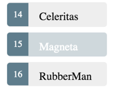
For example, when the user clicks “Magneta”, it should render with a distinctive but subtle background color
like this:
In the template, add the following binding to the <li> tag:
[class.selected]="hero == selected"When the expression (hero == selected) is true, Angular adds the selected CSS class.
When the expression is false, Angular removes the selected class.
The == operator tests whether the given objects are identical, just like
in normal Dart code.
Read more about the [class] binding in the Template Syntax guide.
The final version of the <li> looks like this:
lib/app_component.html
<li *ngFor="let hero of heroes"
    [class.selected]="hero == selected"
    (click)="onSelect(hero)">
  <span class="badge">{{hero.id}}</span> {{hero.name}}
</li>
After clicking “Magneta”, the list should look like this:
Review the app structure
Your project should have the following files:
- angular_tour_of_heroes
- lib
- app_component.{css,dart,html}
- src
- hero.dart
- mock_heroes.dart
- test
- app_test.dart
- …
- web
- index.html
- main.dart
- styles.css
- analysis_options.yaml
- pubspec.yaml
- lib
Here are the files discussed in this page:
The road you’ve travelled
Here’s what you achieved in this page:
- The Tour of Heroes app displays a list of selectable heroes.
- You moved the app template into its own file.
- You moved the
Heroclass underlib/src. - You added the ability to select a hero and show the hero’s details.
- You learned how to use the core directives
ngIfandngForin a component’s template. - You defined styles in a CSS file and made used them to style the app.
Your app should look like this live example (view source).
The road ahead
You’ve expanded the Tour of Heroes app, but it’s far from complete. An app shouldn’t be one monolithic component. In the next page, you’ll split the app into subcomponents and make them work together.